
A data visualization dashboard fixes that by pulling scattered numbers into one screen you can actually read at a glance.
A 2023 Microsoft Work Trend Index survey of 31,000 workers found that 62% struggled with too much time spent searching for information during the workday — a problem dashboards are specifically built to solve (Microsoft, 2023).
This guide breaks down what a data visualization dashboard actually is, the four main types you'll encounter, and how to pick the right one for your team without overbuilding or underdelivering.
Key Takeaways
- Dashboards consolidate multi-source data into one interactive, visual display, unlike static reports
- Four main types exist: executive/strategic, operational, analytical, and real-time/monitoring
- Each type serves a different audience, decision speed, and level of detail
- The best dashboard fits your specific use case, not the one with the most features
- Manufacturers often need more than generic BI charts; industry-specific platforms fill that gap
What Is a Data Visualization Dashboard?
A data visualization dashboard is an interactive interface that pulls data from multiple sources and displays it visually (think charts, gauges, KPI cards, and graphs) all in one place. Instead of digging through three different systems, you look at one screen and get the answer.
Dashboards show up everywhere data-driven decisions happen:
- BI and analytics teams tracking company performance
- Marketing and sales monitoring campaign or pipeline metrics
- Finance watching cash flow and margins
- Manufacturing shop floors tracking machine uptime, labor, and job status in real time
Think of a dashboard less as a report and more as a decision-support tool. Reports tell you what happened. Dashboards help you decide what to do next.
Why It Matters for Data-Driven Decisions
Without a dashboard, teams fall into predictable traps: data silos between departments, delayed decisions because nobody has the full picture, and conflicting numbers when two teams pull from different sources.
That searching-and-reconciling problem isn't small. In Microsoft's 2023 survey, 62% of workers said excess time searching for information was a real struggle, and that's before accounting for the time spent double-checking whose numbers are correct.
A dashboard differs from a single chart or a static report in one key way: it's connected and it's live. A single visualization shows one metric, while a report is a snapshot frozen at print time.
A dashboard keeps updating on a defined cadence and lets users filter, drill down, and explore — setting up the type breakdown below.
Types of Data Visualization Dashboards
Dashboards aren't one-size-fits-all. A dashboard built for a CEO looks nothing like one built for a machine operator, and that's by design. The right type depends on who's using it, how fast the underlying situation changes, and how much detail that person actually needs.
Understanding these four categories helps you match the right dashboard to the right decision-maker, instead of forcing everyone to use the same view.
Executive / Strategic Dashboards
These are built for leadership. They summarize company-wide performance (revenue, margin, customer satisfaction) without drowning anyone in granular detail.
How it works: Cross-functional KPIs get distilled into 3-5 headline metrics. Refresh cadence tends to be weekly or monthly, sometimes quarterly for longer-horizon goals (Klipfolio, 2024).
- Best suited for: C-suite executives and board members needing a 30-second pulse check
- Strengths: Excellent for big-picture alignment and tracking progress against strategic goals
- Limitations: Too shallow for diagnosing why a number moved; you'll need a different dashboard type for that
Operational Dashboards
These track day-to-day activity: order fulfillment, support ticket queues, production counts. They're built for people who need to react, not just observe.
How it works: Refreshes happen near-real-time, often minute-to-minute, and the dashboard flags thresholds or alerts when something needs attention (Klipfolio, 2024).
- Best suited for: Operations managers and team leads reacting to changing conditions throughout the day
- Strengths: Strong for catching issues immediately
- Limitations: Can overwhelm users if too many granular metrics get crammed onto one screen
Analytical Dashboards
These are exploration tools, not monitoring tools. Analysts use them to test hypotheses, compare cohorts, and hunt for patterns that a daily glance wouldn't reveal.
How it works: Heavy filtering, drill-downs, and multi-dimensional slicing across segments, time periods, or correlations.
- Best suited for: Data analysts and power users doing deep-dive investigation, not daily check-ins
- Trade-off: Uncovers insights operational dashboards can't surface, but requires more data literacy to interpret and more setup time to build correctly
Real-Time / Monitoring Dashboards
These connect directly to live data streams, updating anywhere from sub-second to minute-level intervals. They're common in IT operations and industrial environments where waiting even an hour for updated numbers means missing the window to act.
How it works: The dashboard continuously ingests machine, sensor, or system data and surfaces status changes the moment they happen, not after a shift ends.
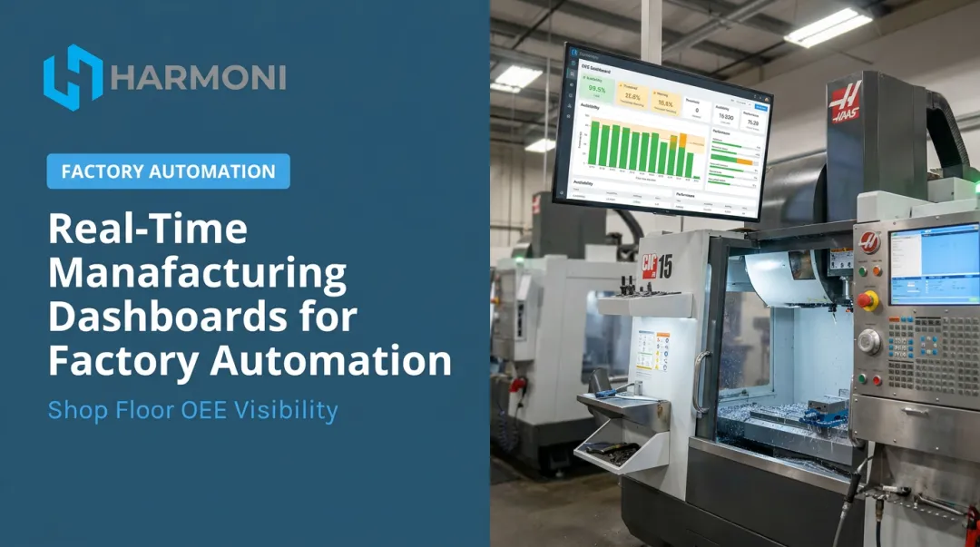
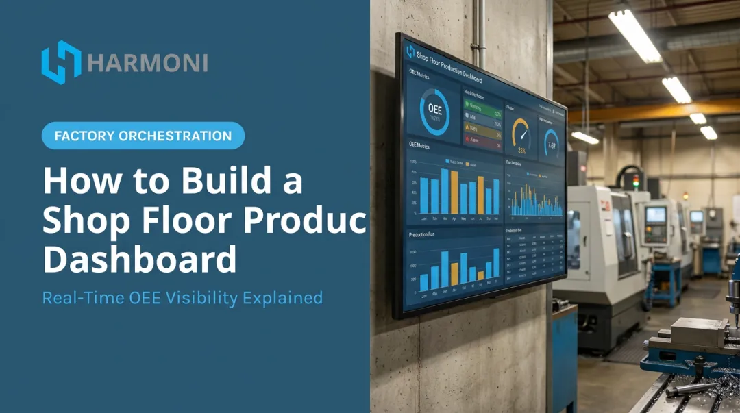
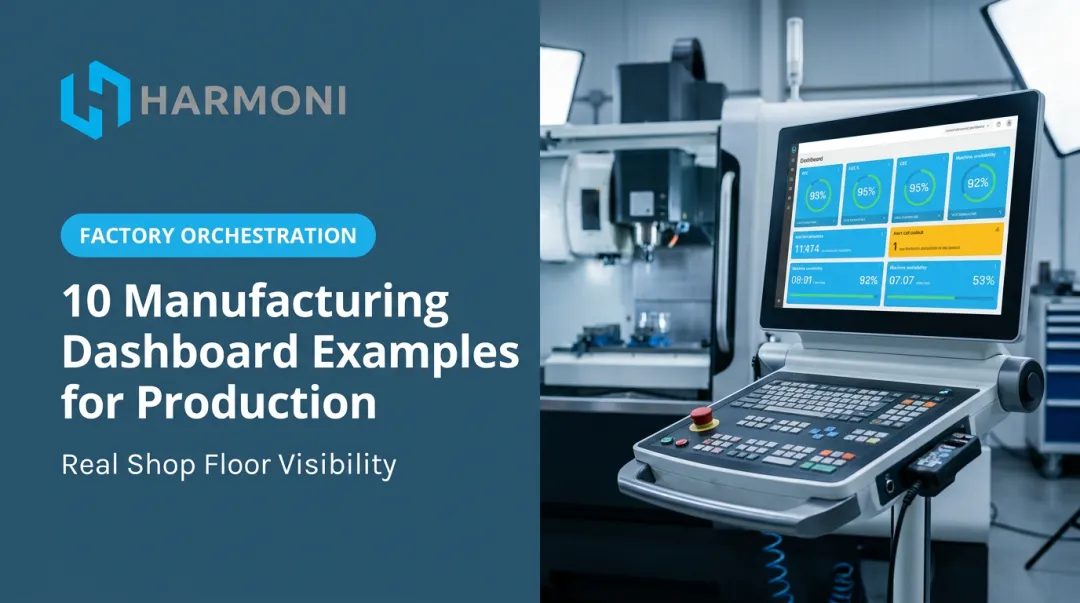
In manufacturing, this is where the category gets interesting. A generic real-time dashboard might show you machine uptime. Harmoni's factory orchestration dashboards go further, unifying three data streams into a single live view:
- Machine data: CNC spindle activity reflecting real-time performance and production status
- ERP data: connecting shop floor activity to costs and profits for accurate job costing
- Operator data: labor assignments, job progression, and work cell activity via long-range RFID
That combination means a shop floor manager can spot a labor gap, a delayed job, or a machine that's gone idle, and address it while production is still running, rather than reviewing a report the next morning and wondering where the hours went.
- Best suited for: Manufacturing floors, IT infrastructure teams, and any environment where catching a problem mid-process prevents costly errors
- Strengths: Unmatched for catching issues as they occur and improving accountability
- Limitations: Requires reliable real-time data infrastructure and tends to cost more to maintain than scheduled dashboards

How to Choose the Right Type of Dashboard
The right dashboard depends on audience and decision speed — not which type looks most sophisticated on a demo call. A beautifully built analytical dashboard is useless if your floor supervisor needs a real-time alert instead.
Weigh these five factors before choosing:
- Purpose. What specific decision does this dashboard need to support? Strategic planning and shift-level troubleshooting call for completely different views.
- Audience skill level. A dashboard packed with pivot-style filters works for an analyst and frustrates an executive checking numbers between meetings.
- Refresh cadence. Match the update speed to how fast the underlying situation actually changes: real-time makes sense on a production floor, while weekly is fine for board metrics.
- Complexity vs. resources. Real-time and analytical dashboards demand more setup and more reliable data infrastructure, so confirm you have the technical resources before committing.
- Budget and scalability. Consider what happens as data sources and users multiply, not just what fits today's needs.
Common mistakes to avoid:
- Defaulting to the most advanced dashboard type when a simpler one would do the job
- Ignoring known trade-offs of a type (like an executive dashboard's shallow detail) and expecting it to answer questions it wasn't built for
- Choosing a familiar tool over the one that actually fits the use case
Popular Data Visualization Tools and Platforms
General-purpose BI tools dominate most conversations about data visualization, and for good reason — they're flexible and work across nearly any industry.
- Microsoft Power BI — holds a 4.4/5 rating from over 3,200 Gartner Peer Insights reviews and was named a Leader in Forrester's Q2 2023 Business Intelligence Platforms Wave
- Tableau — similarly rated 4.4/5 from nearly 4,000 reviews, also named a Forrester Leader
- Looker (Google) — rated 4.5/5 across roughly 1,000 reviews
- Qlik Sense — rated 4.5/5 from over 1,300 reviews, and Qlik was named a Leader in the 2024 Gartner Magic Quadrant for Analytics and BI Platforms for its 14th consecutive year
These platforms excel at flexible, cross-industry visualization. The trade-off: they typically need separate tools for data integration and governance, especially when the data source is a machine on a factory floor rather than a clean database export.
That's where industry-specific platforms come in. Generic charting tools weren't built to talk to a Fanuc control or pull spindle data mid-cycle.
Factory orchestration platforms like Harmoni solve this by combining real-time machine, ERP, and operator data into one unified dashboard. This view is purpose-built for manufacturers, eliminating the need to bolt a standalone BI tool onto machines it was never designed to read.

Conclusion
A data visualization dashboard turns scattered ERP records, machine signals, and spreadsheets into one actionable view. That shift means catching today's problems before they turn expensive.
The four types exist because different roles genuinely need different things. An executive needs a pulse check. A shop floor manager needs an alert the moment a job stalls. Neither dashboard should try to be the other.
Matching dashboard type to actual audience and workflow, not popularity, is what separates dashboards people check every day from ones that get ignored after month two. Harmoni's factory orchestration dashboards pull machine, ERP, and operator data into that single, role-matched view.
Frequently Asked Questions
What is a data visualization dashboard?
It's an interactive display that consolidates data from multiple sources into charts, graphs, and KPI cards in one view. Unlike a static document, it updates on a set cadence and lets users explore the data.
What are the main types of data visualization dashboards?
The four core types are executive/strategic (high-level KPIs for leadership), operational (day-to-day activity tracking), analytical (deep exploration for analysts), and real-time/monitoring (live status updates for floor or IT teams).
What are the top data visualization tools?
Widely used platforms include Tableau, Microsoft Power BI, Looker, Qlik Sense, and Google Looker Studio. For specialized needs like CNC manufacturing, industry-specific platforms such as Harmoni complement these general BI tools.
What are the 5 C's of data visualization?
One established framework defines them as Capture, Clean, Combine, Calculate, and Control, the data-preparation steps that determine whether a visualization can be trusted (DBTA, 2015).
What's the difference between a dashboard and a regular report?
A report is typically a multi-page document built for detailed exploration of one dataset. A dashboard is a single-page canvas designed for a quick, high-level read, often pulling from multiple sources.
How often should a dashboard be updated?
It depends entirely on use case. Operational and real-time dashboards often update by the minute, while executive dashboards are commonly refreshed weekly, monthly, or quarterly based on how fast the underlying metrics actually shift.