
Introduction
A wrong decision made an hour too late can cost a manufacturer an entire shift's worth of output. Missed downtime alerts, operators running the wrong program, quality issues caught after the fact — these happen every day on shop floors still relying on whiteboards, end-of-shift reports, and manual data entry.
Manufacturing dashboards exist to close that gap. They give plant managers, supervisors, and operators a live window into production performance covering everything from machine utilization and OEE to job costing and operator output. The data arrives in time to act on it, not after the shift is over.
According to the Manufacturing Leadership Council, 70% of manufacturers still enter production data manually — a figure that explains why so many shops operate a shift behind on the information they actually need.
This post walks through 10 specific manufacturing dashboard examples, what each one tracks, and how to match them to your shop floor's biggest operational gaps.
Key Takeaways
- Live manufacturing dashboards pull data from machines, ERPs, and operators — replacing manual reporting with decisions made in real time.
- The 10 dashboard types range from plant-wide production overviews to granular job costing and operator performance views.
- Role matters: operators, supervisors, and plant managers need different data — one dashboard doesn't serve all three well.
- Live-connected dashboards drive decisions. Manually updated ones only confirm what already happened.
- Start with one or two high-impact views, validate data accuracy, then expand.
What Is a Manufacturing Dashboard?
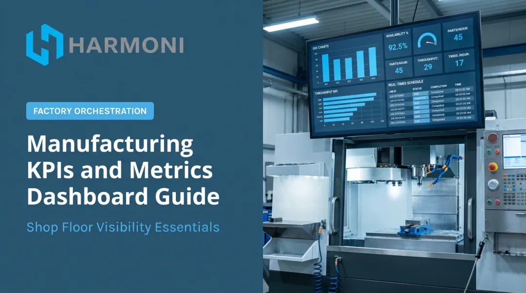
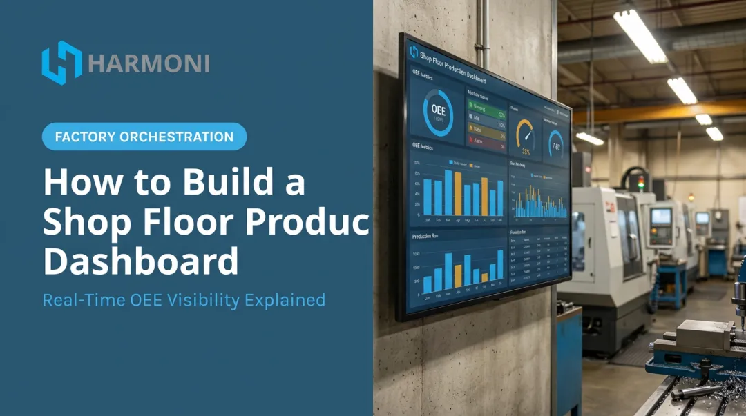
A manufacturing dashboard is a real-time visual interface that aggregates data from machines, ERP systems, sensors, and operator inputs to display production KPIs — replacing manual whiteboards, spreadsheets, and end-of-shift reports with live, actionable information.
In practice, that data surfaces as charts, gauges, color-coded alerts, and trend graphs — visible on shop floor screens or accessible remotely from any device.
How Modern Platforms Go Further
Standalone machine monitoring tools show machine states. What they typically miss is context — why a machine is idle, which job it's affecting, and whether the labor hours match what the ERP estimated.
Platforms like Harmoni's factory orchestration software combine machine data, ERP workflows, and operator activity into a unified dashboard view — closing that context gap in one place.
When MSI (Machine Specialties, Inc.) integrated Harmoni with their Epicor ERP, managers shifted from tracking only spindle time to tracking earned hours per job. That shift gave them profitability insight that machine monitoring alone couldn't provide.
Each dashboard type below reflects a different layer of that visibility — from machine uptime to labor efficiency to quality.
10 Manufacturing Dashboard Examples for Production
These 10 examples represent the most impactful dashboard types used in production environments today — from high-level overviews to role-specific execution tools.
1. Production Overview (Mission Control) Dashboard
The highest-level dashboard in any manufacturing environment. Designed for plant managers and operations leads who need a bird's-eye view of the entire shop floor without walking it.
What it typically displays:
- Active production lines and their current status
- Units produced vs. daily targets across all lines
- Shift summaries and changeover status
- Safety incident counters
- Line-level breakdowns with drill-down capability for deeper investigation
This is the dashboard that answers "how is today going?" in under 30 seconds. When something needs attention, the drill-down capability lets managers go from plant-wide view to a specific machine or operator without switching systems.
2. OEE (Overall Equipment Effectiveness) Dashboard
The most essential production monitoring tool for equipment-intensive shops. The OEE dashboard tracks the three components of equipment effectiveness — Availability, Performance, and Quality — and combines them into a composite score showing how efficiently each machine is running.

What it displays:
- Real-time OEE score per machine or across the fleet
- Availability: planned vs. unplanned downtime
- Performance rate: actual vs. ideal cycle time
- Quality rate: good parts vs. total parts produced
- Color-coded thresholds to flag underperforming assets instantly
Vorne's widely cited benchmarks reference 60% as typical and 85% as world-class for discrete manufacturers — useful reference points when setting internal targets, though these are industry conventions rather than statistically validated survey results.
Harmoni's platform includes OEE monitoring across all three pillars, with andon-style visual indicators that communicate machine status to both operators and managers in real time.
3. Daily Production Dashboard
Hour-by-hour output tracking against planned targets gives supervisors and line leads a live view of whether each shift will hit its quota before it ends.
What it displays:
- Actual units produced vs. goal per hour and cumulatively
- Variance: how far ahead or behind schedule each line is
- Shift-over-shift comparison for trend visibility
- Mobile-accessible views for off-floor monitoring
The hour-by-hour breakdown is what makes this dashboard operationally useful. A supervisor who can see a production shortfall at hour three has time to respond — adjusting staffing, clearing a bottleneck, or escalating a machine issue — rather than discovering the miss after the shift closes.
4. Operator Performance Dashboard
Individual operator output and task execution, measured at the step level, surfaces two things: top performers who've found faster methods, and operators who need support before errors compound into scrap or rework.
What it displays:
- Time spent per task or step by operator
- Step-level comparison across operators on the same job type
- Trend data over time to track improvement or regression
The most valuable use of this dashboard isn't ranking operators — it's learning from variance. If one operator consistently completes a multi-step assembly faster with fewer errors, that method is worth documenting and sharing.
5. Machine Utilization Dashboard
In CNC-heavy environments, knowing exactly how each machine's time is being spent — running, idle, in setup, or offline — is the foundation of spindle time improvement. That's what this dashboard delivers.
What it displays:
- Machine state in real time (running, idle, setup, offline)
- Utilization percentage per machine over a shift or week
- Setup time vs. run time ratios
- Fleet-wide comparison view for scheduling and capacity planning
Coastal Machine and Supply deployed real-time machine monitoring and saw utilization on a pallet-equipped five-axis machine increase 46% — a result driven by downtime alerts and actual-vs.-estimated cycle time grading. One machine's data, turned into action.

6. Quality and Scrap Rate Dashboard
The quality control nerve center. This dashboard tracks defects, scrap rates, and first pass yield in real time so quality issues can be caught during production — not discovered during final inspection or after shipment.
What it displays:
- Defect rate by line, machine, or operator
- First pass yield percentage
- Scrap cost in dollars (when tied to ERP data)
- Defect categories ranked by frequency
- Trend lines showing whether quality is improving or degrading
A scrap rate percentage tells you there's a problem. Scrap cost per job tied to specific machines or operators tells you where to fix it.
NIST documented a precision manufacturer — Carlyle Johnson Machine — that improved first pass yield from 10% to 90%, cut lead time from 43 to 5 days, and documented $100,000 in savings through focused quality improvement work. None of that improvement happens without knowing which machine, operator, or process step is generating the defects.
7. Maintenance and Downtime Dashboard
That two-way flow keeps the WIP dashboard current — showing what's actually happening on the floor, not a scheduled plan written before the shift started.
9. Labor Visibility Dashboard
Across a busy shop floor, it's often unclear who is working on what — and for how long. This dashboard tracks operator-to-job assignments in real time, showing where labor hours are actually going versus where they were planned.
What it displays:
- Operator-to-job assignments in real time
- Labor hours logged per job vs. estimated
- Idle or unassigned operator time
- Shift-level labor utilization
Harmoni's RFID-based identification connects this directly to the machine side. When an operator scans in at a work cell, the system automatically links that person to a specific machine, job, and set of work instructions. At MSI, this RFID layer enabled the shop to tie earned hours to individual jobs and surface profitability data that spindle time tracking alone couldn't provide.
J&R Machine, a 20-machine CNC contract shop, created a productivity index dividing machine green hours by operator payroll hours. When monitoring began, the ratio ranged from 0.57 to 0.88; after consistent tracking and visibility, it regularly reached 1.2 to 1.4 — a concrete example of what labor visibility actually changes.
10. Job Costing Dashboard
One of the most underutilized but highest-value dashboard types in precision and contract manufacturing. This financially oriented dashboard compares actual job costs — labor, machine time, material — against estimated costs, exposing the margin variance that shows up only after jobs close.
What it displays:
- Actual vs. estimated labor hours per job
- Machine cost per job based on real utilization data
- Variance by job or customer
- Cumulative cost performance across all open orders
Harmoni's platform captures actual cycle times and labor records, then pushes that data back into ERP systems so job costing reflects what happened on the floor — not the estimate written months ago when the quote went out. For high-mix, low-volume shops, that gap between estimated and actual is where margin disappears. Closing it requires data, and this dashboard makes that data visible.

Key KPIs Every Manufacturing Dashboard Should Track
Not every KPI belongs on every dashboard. The most universally tracked production metrics — and what each one tells you:
| KPI | What It Measures |
|---|---|
| OEE | Combined availability, performance, and quality as a single equipment effectiveness score |
| Throughput | Units produced per shift, day, or hour against planned targets |
| Cycle Time | Actual time to complete one unit vs. standard/estimated time |
| First Pass Yield | Percentage of parts produced correctly without rework or scrap |
| Downtime | Planned and unplanned equipment loss time, by reason |
| Scrap Rate | Defective parts as a percentage of total produced |
Match KPIs to Roles
The table above covers what to measure — but who sees what matters just as much. Overloading any dashboard with every available metric defeats its purpose:
- Operators need live task status, job targets, and immediate alerts
- Supervisors track shift metrics, variance, and line comparisons
- Plant managers need throughput, OEE, and downtime impact
- Executives want cost-per-unit and on-time delivery summaries
A scrap rate on its own is a number. That same scrap rate tied to a specific machine, operator, and job type is something a team can actually fix — and that's the difference between a dashboard people glance at and one they act on.
How to Choose the Right Manufacturing Dashboard for Your Shop Floor
Start with Your Biggest Pain Point
The right starting point is identifying what's costing you the most — unexplained downtime, missed daily targets, quality escapes, or inaccurate job costs. Select the dashboard type that provides direct visibility into that problem first, not the most technically impressive option.
Evaluate These Selection Criteria
Before committing to any platform or dashboard configuration:
- Data source compatibility — Can the dashboard connect to your existing CNC machines, ERP, and MES without major custom development?
- Real-time vs. historical capability — Do you need live alerts, trend analysis, or both?
- Role-based views — Will operators, supervisors, and plant managers each see the data relevant to their role, or is everyone looking at the same screen?
- Deployment timeline — How quickly can live data start flowing?
- Scalability — Can it expand across additional work centers or facilities as your needs grow?
Don't Try to Build Everything at Once
The most common mistake is attempting to deploy every dashboard simultaneously. Start with one or two high-impact views — typically the production overview and OEE dashboard. Validate data accuracy, build operator adoption, then expand to additional dashboard types as confidence in the data grows.

Shops that phase their rollout this way consistently see faster adoption and cleaner data — which is what makes every subsequent dashboard actually useful.
Conclusion
Manufacturing dashboards are the foundation of real-time operational decision-making — giving every role in the plant the visibility needed to act before a small problem becomes an expensive one.
Review your current operational blind spots against the 10 dashboard types covered here. Then ask whether your current tools can actually deliver the real-time, connected data those dashboards require — or whether you're still relying on end-of-shift reports to make today's decisions.
If your current tools can't close those gaps, Harmoni's factory orchestration platform connects machine data, ERP workflows, and operator activity into live dashboards across the shop floor. It also automates workflows and prevents production errors before they occur. Request a demo at harmoni.io/demo to see how it works in a shop like yours.
Frequently Asked Questions
What is a manufacturing dashboard?
A manufacturing dashboard is a real-time visual interface that aggregates production data from machines, ERP systems, and operators into charts, KPI cards, and alerts. It gives teams an at-a-glance view of shop floor performance without relying on manual reporting or end-of-shift summaries.
What are the four types of dashboards?
The four common types are operational (real-time process status), analytical (trend and historical analysis), strategic (high-level KPIs for leadership), and tactical (shift- or task-level execution for supervisors and operators) — and most manufacturing environments use some combination of all four depending on the audience.
What KPIs should be included on a manufacturing production dashboard?
The most critical production KPIs are OEE, throughput, cycle time, first pass yield, planned and unplanned downtime, and scrap rate. The right selection depends on the dashboard's intended audience — an operator's dashboard and an executive's dashboard should look very different.
What is the difference between a real-time and a historical manufacturing dashboard?
Real-time dashboards display live data updated in seconds or minutes, used for immediate response to downtime alerts, production shortfalls, and quality flags. Historical dashboards analyze trends over time to support root cause analysis, capacity planning, and continuous improvement reviews.
How does a manufacturing dashboard connect to an ERP or MES system?
Most platforms connect via APIs, direct database connections, or middleware — pulling job data, routing information, and labor records to combine with machine and sensor data. Harmoni supports native integrations with Epicor, Infor, Infor Visual, JobBoss, and others, with bi-directional data flow between the shop floor and the ERP.
Can manufacturing dashboards be customized for different roles?
Role-based dashboards are a best practice. Operators should see task queues and live machine status; supervisors need shift metrics and quality trends; executives need throughput summaries and cost performance. Presenting the same view to all users creates noise that reduces the dashboard's usefulness.