Introduction
Picture this: a plant manager walks in at 6 AM, pulls up yesterday's ERP report, reviews the morning huddle notes, and checks the clipboard from the night shift. By the time they understand what actually happened, the day shift is already two hours in. Now picture a different facility — one where a glance at the shop floor screen shows every machine's status, which jobs are running, and whether production is on pace. The gap between those two scenarios is a machine dashboard. Or rather, the right machine dashboard.
Machine dashboards have become the operational backbone of modern manufacturing — but not all of them drive decisions. Many just display data. According to a 2025 Manufacturing Leadership Council survey, 79% of manufacturers still include manually entered data in their analytics supply chain, and 78% rely on Excel as their primary analytics tool. Real-time, automated visibility remains far from universal.
This article explains what a machine dashboard is, why many fail to change shop floor behavior, what yours should display in 2026, and how to choose and implement one that delivers measurable results.
Key Takeaways
- Machine dashboards in 2026 surface real-time machine status, performance, and production data — including ERP and operator context in a single view
- Active dashboards trigger responses when conditions change; passive ones only display data — that gap determines how fast you recover from downtime
- Core KPIs to track: OEE (Availability, Performance, Quality), machine utilization, cycle time vs. standard, and downtime reason codes
- Match your dashboard choice to your connectivity needs, ERP integration depth, and how operators will physically access it on the floor
What Is a Machine Dashboard?
A machine dashboard is a centralized, real-time digital interface that aggregates data from connected machines and displays it visually on shop floor monitors, workstation screens, or mobile devices. It replaces the clipboard-and-morning-meeting model of performance reporting.
How It Collects Data
The dashboard connects directly to machine controllers via protocols like MTConnect (used across more than 250,000 devices in over 50 countries) or OPC-UA, capturing raw signals — spindle load, cycle counts, machine state — and converting them into readable KPIs. Some solutions use hardware adapters for legacy equipment; others rely on native CNC protocols for modern controllers.
Who Sees What
Machine dashboards serve different audiences, and the best ones serve each differently:
- Operators see their machine's current job status, active work instructions, and parts count
- Supervisors see a multi-machine overview with color-coded states and performance gaps
- Plant managers see aggregate OEE, shift summaries, and downtime trends across the floor
How It Differs from ERP and MES
Using ISA-95 as a reference framework, each system occupies a distinct layer of the manufacturing stack:
| System | ISA-95 Level | Primary Function |
|---|---|---|
| ERP | Level 4 | Planning and recording business transactions |
| MES | Level 3 | Managing work orders, routing, and quality workflows |
| Machine Dashboard | Levels 0–2 | Surfacing what is happening on equipment right now |
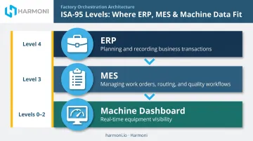
These systems work together; none replaces the others. The machine dashboard's job is immediate visibility — which is why the "tile" model has become the standard visual metaphor. Each machine appears as a color-coded block showing status, performance percentage, and output rate, letting a supervisor read the entire floor at a glance without navigating menus.
Why Most Machine Dashboards Fail to Drive Results
Many manufacturers install screens that display data but never change behavior. If a machine turns red and no one knows what to do next, the dashboard has failed its primary purpose. The causes are predictable.
The Passive Display Problem
A dashboard that shows downtime is occurring but provides no path to open a work order, assign a technician, categorize a root cause, or escalate an issue is just a scoreboard. Data without a next step is noise.
LNS Research identifies three core analytics failure mechanisms: data quality problems, legacy systems with incompatible data models, and the effort required to contextualize raw data before it becomes actionable. Mounting a screen on the wall solves none of them.
The Stale Data Problem
Dashboards built on BI tools or pulled from ERP reports refresh periodically — every 15 minutes, every hour, sometimes once per shift. By the time the data reaches the screen, the opportunity to respond has passed. True real-time data capture, pulled directly from the machine controller, is the only architecture that enables in-the-moment decisions.
The Context Gap
A machine showing 62% utilization tells you performance is low. It doesn't tell you why. Is the operator on break, or is setup still in progress? Is a component missing from the cell? Without context layered onto the machine signal, supervisors guess — or walk the floor to find out — which defeats the purpose of having a dashboard.
What an Active Dashboard Actually Does
Those three failure points share a common fix: dashboards that require action, not just attention.
The best machine dashboards in 2026 are interactive. Clicking a downtime event opens a categorization prompt. A machine falling behind on parts triggers an alert. A supervisor can drill into any machine to see the underlying cause. This transforms the dashboard from a passive display into a command interface — one that closes the loop between what the floor is doing and what needs to happen next.
What Your Machine Dashboard Should Display in 2026
OEE and Its Three Components
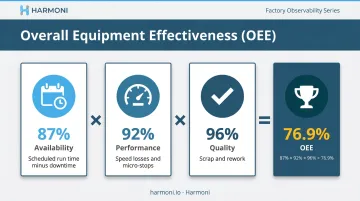
Overall Equipment Effectiveness — Availability × Performance × Quality — remains the gold-standard KPI for machine dashboards. Displaying OEE broken into its three components is critical: it tells you where the loss is occurring.
- Availability captures downtime relative to scheduled run time
- Performance captures reduced speed and micro-stops that erode throughput
- Quality captures scrap and rework losses
A single OEE number hides more than it reveals. A machine running at 78% OEE due to frequent micro-stops needs a different intervention than one running at 78% due to a slow changeover process.
Machine Operating Status and Time-in-State
Color-coded state indicators (running, idle, stopped, in setup, faulted) are the foundational layer. What gives those colors meaning is duration. A machine idle for 23 minutes mid-shift is a visible problem requiring intervention; the same 23 minutes at shift end may not be.
Time-in-state transforms a status flag into an actionable alert. Harmoni's patent-pending Visual Factory OEE Indicator Lights take this further — communicating not just whether a machine is running, but whether it's running efficiently, using real-time OEE data to drive the color state rather than spindle status alone.
Parts Produced vs. Target by Hour
The hourly bar chart is one of the most underrated views on a machine dashboard. Showing actual parts produced against the hourly goal gives supervisors a leading indicator of whether the shift will hit its target — while there's still time to recover. End-of-shift reports tell you what went wrong; hourly tracking tells you what's going wrong now.
Cycle Time vs. Standard
Actual cycle time against expected cycle time catches performance losses that OEE can mask. A machine running at 90% utilization with cycle times 15% over standard is losing capacity quietly — technically running, but well below its potential output. This KPI is especially valuable in high-mix environments where cycle time variation is a frequent source of schedule slippage.
Downtime With Categorized Reason Codes
Raw downtime data — machine stopped — offers no path to root cause. Categorized downtime enables Pareto analysis and targeted elimination. Harmoni's OEE framework captures six specific stop categories:
- Changeover
- Breakdown
- Micro-stop
- Material wait
- Operator wait
- Quality hold
The goal is to direct improvement effort toward the highest-impact categories, not just log hours lost.
Operator-entered reason codes, prompted directly at the machine when a stop event is detected, are far more accurate than retrospective reporting at shift end.
Beyond Machine Data: The 2026 Standard for Shop Floor Dashboards
First-generation machine dashboards showed machine signals in isolation. That's no longer sufficient.
The Unified View
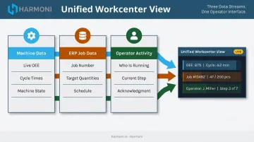
The 2026 standard integrates three data streams into a single workcenter view:
- Machine data — live cycle times, OEE, downtime events from the controller
- ERP job data — what job is running, scheduled completion, production targets, cost context
- Operator activity — who is at the machine, what step they're on, what instructions they've acknowledged
When all three streams are visible together, supervisors have everything needed to respond without walking the floor, making phone calls, or waiting for a shift report. That's the difference between reactive and proactive operations management.
What This Looks Like in Practice
Consider a supervisor who sees that Line 4 is running Job #7823, currently two hours behind schedule, and that the operator last logged activity 40 minutes ago. Without a unified dashboard, discovering that combination requires three separate conversations and a floor walk. With one, it surfaces automatically — and the supervisor can act.
That unified model is the foundation of Harmoni's factory orchestration platform. Rather than treating machine monitoring as a standalone point solution, Harmoni combines real-time machine data, ERP workflows, and operator activity into a single dashboard view at each workcenter. Long-range RFID automatically identifies who is at each machine, so operator presence is tracked without manual check-ins. The result is operational context alongside every data point — not just raw numbers on a screen.
How to Choose and Implement a Machine Dashboard
Choosing the Right Dashboard
Start by asking vendors exactly how the dashboard connects to your specific machine controllers — Fanuc, Haas, Mazak, Heidenhain, Siemens, DMG MORI, Makino, Fadal. A dashboard that can't reliably capture data from your equipment is a non-starter. Push on data latency at each connectivity layer: native CNC protocol, MTConnect, hardware adapter, or manual entry all have different implications for data freshness.
ERP integration depth is the next filter. A dashboard showing machine data in isolation is useful; one that surfaces ERP job data alongside machine performance is a fundamentally different tool. Determine whether the integration is read-only or bidirectional, and confirm it supports your specific ERP — JobBoss, Epicor, Infor, SAP, ABAS, or otherwise.
Finally, match the interface to where work actually happens. A dashboard visible only on a manager's laptop does not improve shop floor behavior. Evaluate:
- Large-format displays for shop floor visibility
- Workstation screens at individual machines
- Mobile access for supervisors walking the floor
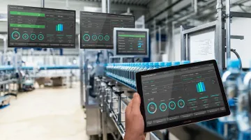
The physical deployment model matters as much as the software.
Implementation Starting Point
With the right dashboard selected, the implementation approach determines whether it actually sticks.
Start with one cell or workcenter. A single production cell lets teams validate connectivity, calibrate reason code libraries, and build operator familiarity before scaling. It also contains the risk — if something needs adjustment, it affects one area, not the plant. Research backs this up: broad Industry 4.0 pilots fail to scale at high rates when teams try to solve everything at once rather than proving value in a controlled environment first.
Screens on walls are not the goal. Before go-live, identify one specific behavior you want to change — supervisors respond to downtime events within 10 minutes, operators log reason codes for every stop — and measure it from day one. Technology adoption is measured in changed habits, not installed screens.
Frequently Asked Questions
What is a machine dashboard in manufacturing?
A machine dashboard is a real-time digital interface that displays machine status, performance metrics, and production data — updated continuously from direct machine connections. It differs from ERP reports (which record historical transactions) and MES screens (which manage work orders and routing) by showing what's happening on the equipment right now.
What data should a machine dashboard display?
A useful machine dashboard covers three categories: equipment state (running, idle, faulted), production progress (parts made vs. target, cycle time vs. standard), and loss accounting (downtime by reason code and OEE). Together, those layers give operators a current snapshot and supervisors the context to act on it.
How is a machine dashboard different from an MES or ERP system?
ERP plans and records at the business level. MES manages work orders, routing, and execution workflows. A machine dashboard surfaces real-time equipment performance and production status. They're complementary layers — per the ISA-95 framework — not substitutes for each other.
What is the difference between a real-time and a historical manufacturing dashboard?
Real-time dashboards capture data directly from machine controllers and update continuously, enabling in-shift decisions. Historical dashboards — like BI reports built from ERP data — aggregate past data on a refresh cycle, making them useful for analysis but not for responding to what's happening right now.
What KPIs should I track on a machine dashboard?
Prioritize OEE (Availability, Performance, Quality), machine utilization, cycle time vs. standard, parts per hour vs. target, and downtime by reason code. Tracking all five gives supervisors enough context to intervene before a gap turns into a missed shift target — rather than discovering the loss after the fact.
How long does it take to implement a machine dashboard?
Timelines vary depending on machine connectivity, ERP integration scope, and the number of workcenters involved. Modern CNC environments with standard controls can go live in days; legacy machine integration and ERP data mapping typically add weeks. Starting with a single cell keeps initial complexity manageable and lets teams validate the setup before expanding.